Dashboard Widget

About Spreetail
Spreetail is an e-commerce company that helps brands/vendors sell, market, and grow their businesses across multiple marketplaces. To develop a strong partnership with their vendors, they have built a Partner Portal. The Portal allows vendors to view key metrics, notifications, and data to see how well their items are performing with Spreetail.
Working closely with a fellow UX Designer and Product Manager, my focus was on adding a new Suppression Widget and Feature to their Partner Portal.
Role
UX Designer
UX Researcher
Timeline
May 2022 - July 2022
The Problem
Spreetail’s Vendor Managers were sending out emails and scheduling additional weekly meetings to update their vendors on suppression issues that were limiting their sales. Vendors were eager to tackle suppression, but did not have the resources to resolve these issues without their Vendor Manager.
Problem Statement
There was an opportunity to provide consistent visibility and actionable insights related to suppression within the Partner Portal in order to decrease the overall number of suppressed SKUs.
Assumptions
The product team wanted to move quickly on this project and use rapid prototyping to test quickly with Vendors. To lay a strong foundation for our first designs, I wanted to understand all of my assumptions:
Vendors want to feel empowered with actionable insights
Suppression is important to our vendors
Vendors want to see suppression on the dashboard
Most vendors will have a limited understanding of suppression
Vendors want to see the most important data points to them
Internal Validation
The proposed concept from the business was to add a widget to the dashboard that would prompt users to call their Vendor Manager. However, based on the assumptions I had developed, the product team decided that a more actionable design would add more value to our vendors.
To highlight how we could make our vendors more self-sufficient, I created two different journey maps that would allow us to understand our options. The journey maps below were used to communicate how our suggested journey would empower our vendors during our Stakeholder check-in meeting.


Sketches & Wireframes
Once we had stakeholder approval to pursue the product team’s suggested journey map, I began to ideate concepts. Through a crazy 8s and lightning demo sketch session, I was able to develop an initial workflow for the feature.

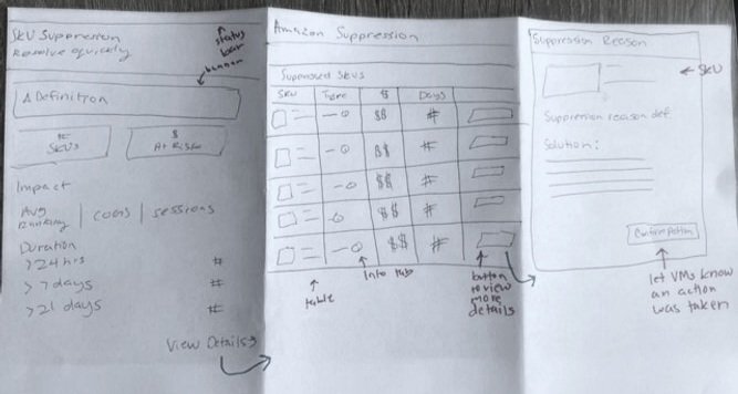
Once the initial concept was decided, I began to wireframe to set the foundation.


Initial Mocks
Using our design system Meta. I was able to put together high-fidelity mocks.
The widget gives high-level insights on the dashboard so vendors can understand how suppression is impacting their sales.

Dashboard Widget

Suppression Feature
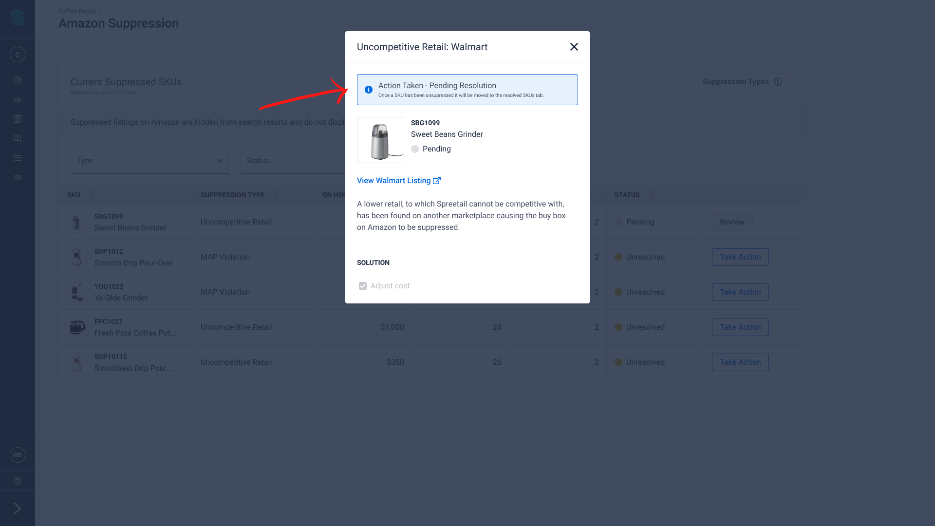
The table lists all of the suppressed SKUs and provides more information on why the SKU is suppressed. To resolve the suppression, vendors can learn how by clicking into the Resolutoin Modal. Once an action is confirmed, they can check the status of the SKU by looking at the Pending Resolution Modal.
To resolve the suppression, vendors can learn how by clicking into the Resolution Modal. Once an action is confirmed, they can check the status of the SKU by looking at the Pending Resolution Modal.
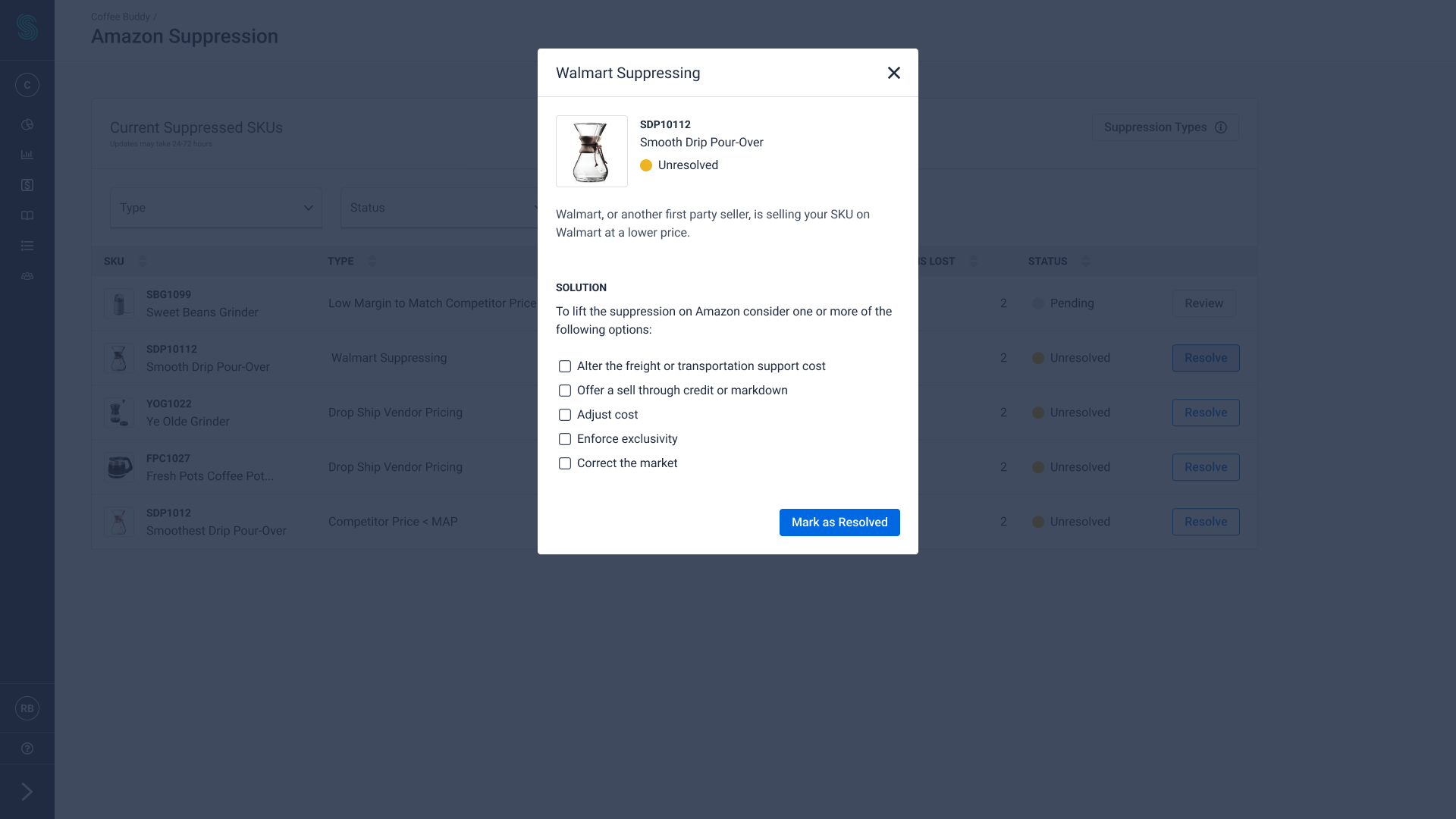
Resolution Modal

Pending Resolution
Concept Validation & Usability testing
Using the initial mocks I created, the product team and I conducted 5 usability tests to gather insights on our new feature.


Key Insights
To better identify key insights and themes from our research, I analyzed the data using an affinity map. Overall the vendors really enjoyed the feature and it garnered an average ranking of 7/10 for its importance.

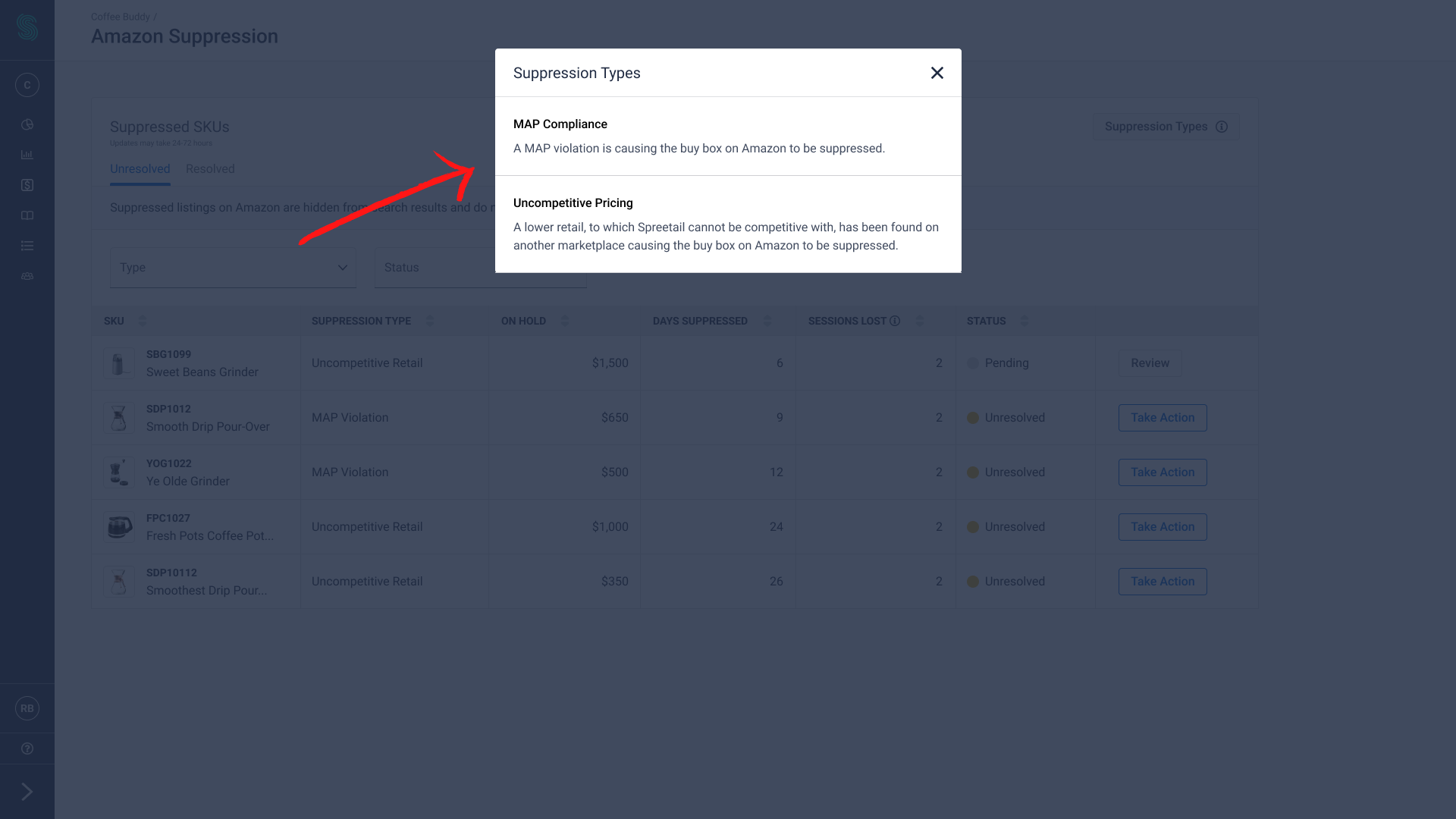
1. Vendors had a limited understanding of suppression and how to fix the issue. To add clarification, three changes were made:
We worked with internal team members to update the copy for the suppression types,
I added a suppression definition to the table, and
I added a tooltip to the table to help

2. Vendors pointed out to us that we were not providing the right information in the resolution modals. To rectify this, I made the following enhancements:
Included a link so vendors can view the competitor’s listing,
Updated the solutions that vendors can select to better suit their needs, and
Increased the time that the SKU could be pending from 24 hours to an indefinite timeline that gives vendors flexibility.

Final Prototype
After a feasibility check with our developers, I was able to finalize our prototype for the dev team.
Outcomes
We were able to track that the number of calls to their vendor manager decreased by 12%. This allows vendor managers to focus on more important issues with their vendors. To continue expanding on this feature, more research would need to be done with vendors to see how it meets their needs in practice.
Lessons Learned
During this project, I was able to develop my data visualization skills when I was designing the widget. We wanted to add a lot of key data that would give vendors insight into the suppression feature before drilling down deeper. To structure the information well, I used color and fonts to convey the importance of the different information.